01 / Clinical workspace
The report and the reason to review it.
Inspect source evidence alongside report sections. Open mapped anatomy in the Atlas, then return to the clinician-led review.
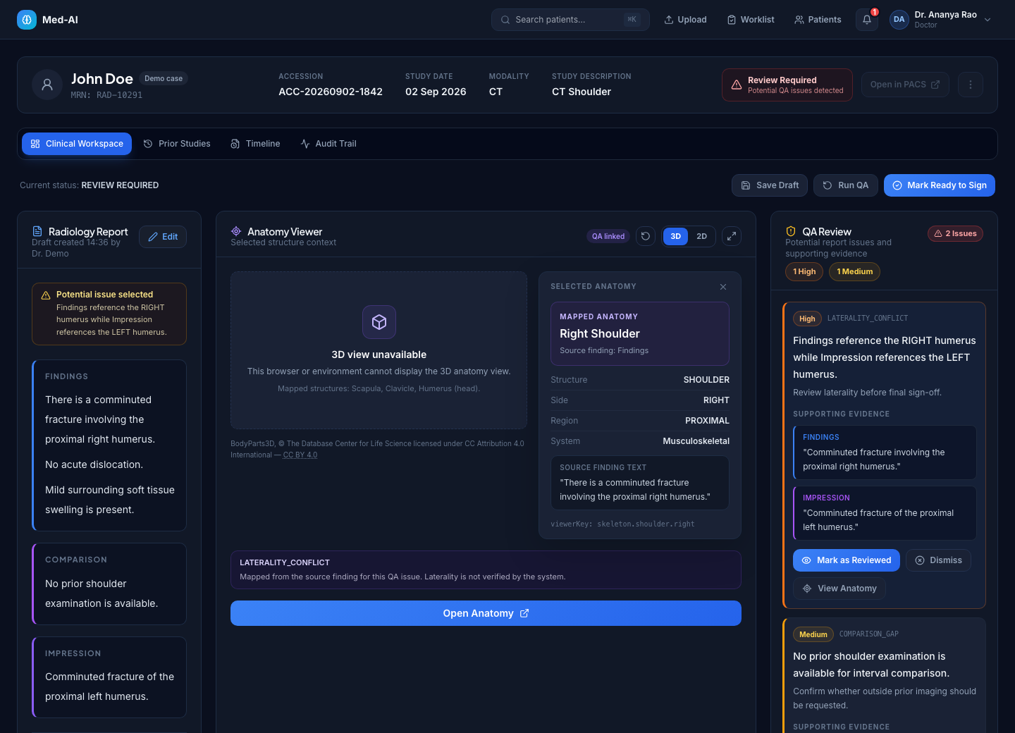
Fresh captures of the current application. Real interface, synthetic cases. Explore the details at your own pace.
Inspect source evidence alongside report sections. Open mapped anatomy in the Atlas, then return to the clinician-led review.
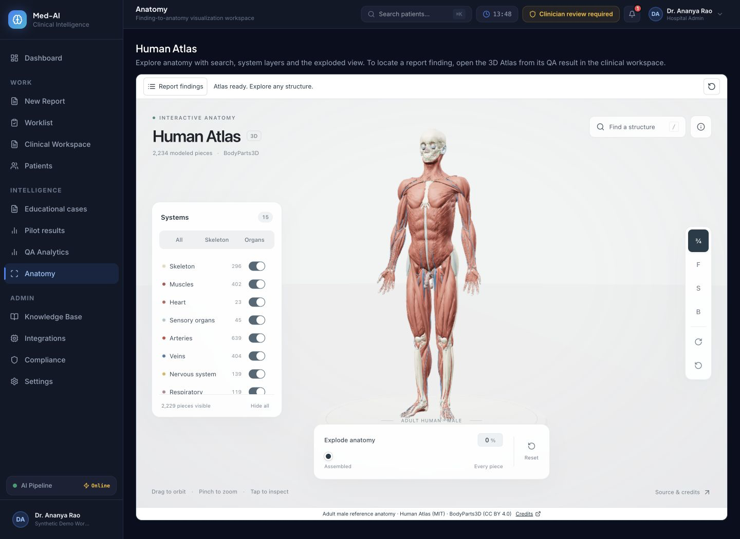
Explore reference anatomy using search, system layers and camera controls. The atlas is an educational reference, not a reconstruction of the patient.
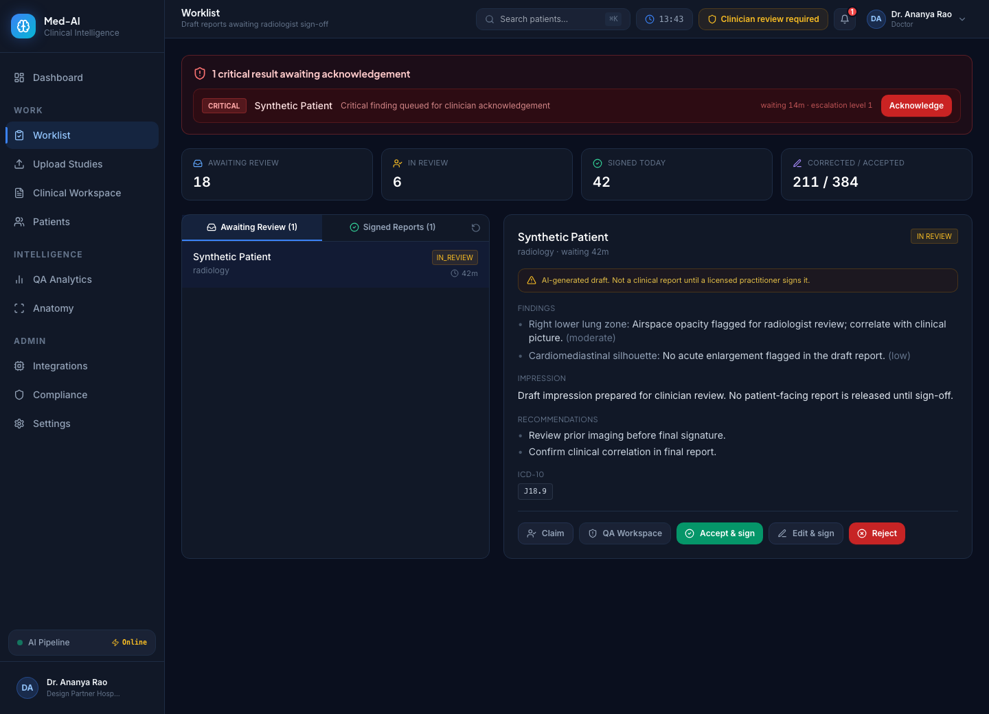
See pending reviews, sign-off status and critical acknowledgement actions in one queue.
Navigate reports and review tools from the workspace overview. Values shown here are synthetic examples, not customer results.

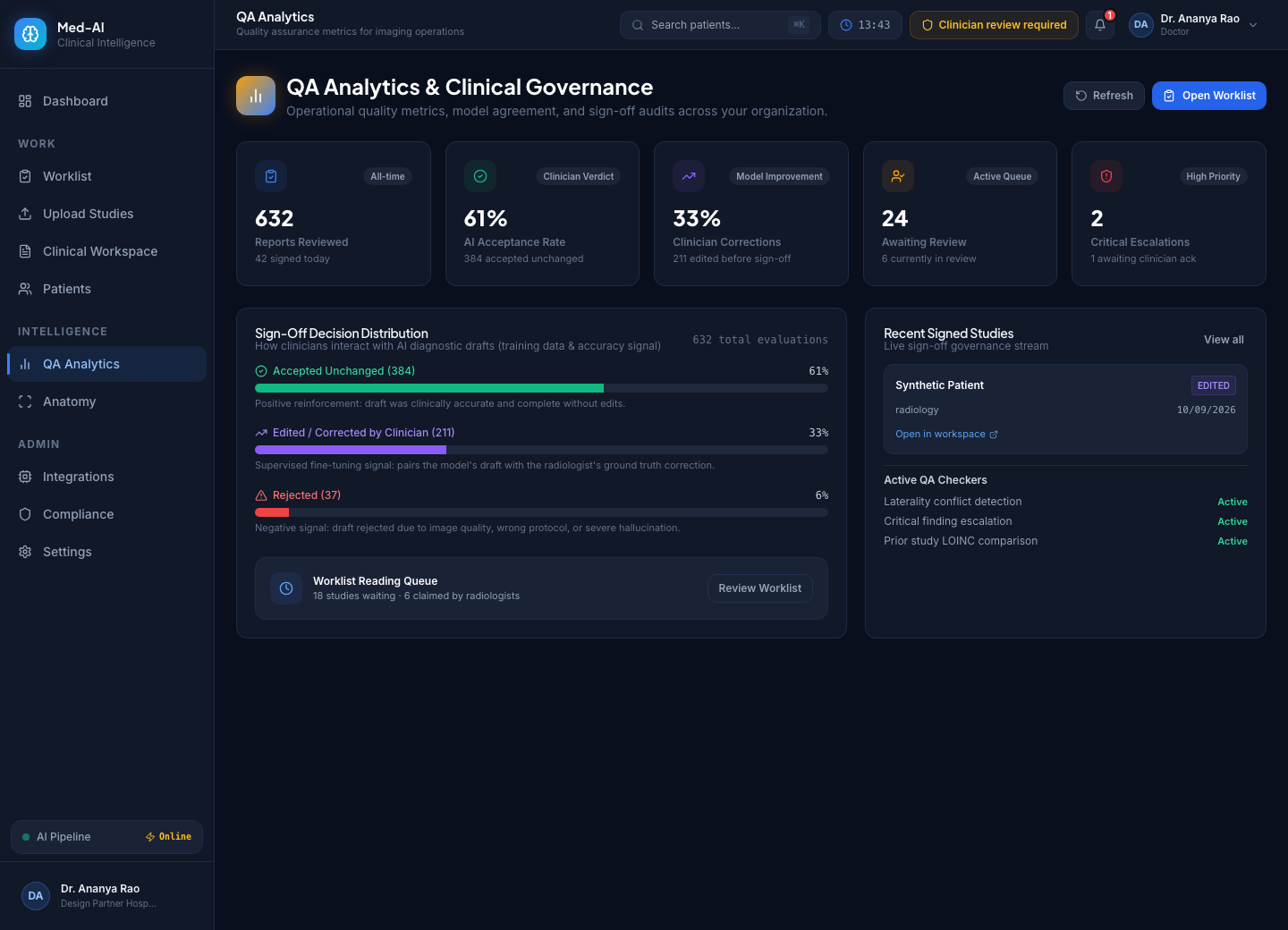
Inspect accepted, edited and rejected reviews. Use a defined baseline and the evaluation guide before interpreting results.
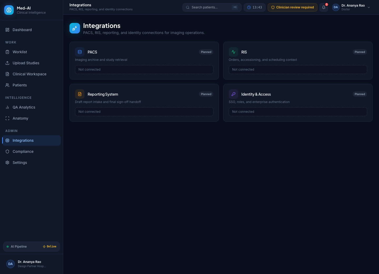
Inspect available connectors and configuration requirements. Each connection requires setup and validation for your centre.
Start with a synthetic case. Request free access when you’re ready to evaluate with your team.